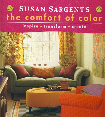
Every decade has unique interior decorating trends: the 60s had flower power, the 70s had shag carpeting and appliances in avocado green or harvest gold, the 80s were pretty in pink (remember pink wall-to-wall carpeting?), the 90s had minimalism, and the 2000’s and beyond had beige–ugh. For the love of beige, I just don’t get it. Who wants to surround themselves with this drab, non-color? It doesn’t get any more boring, depressing, or predictable than beige. For the last 10 years, open any decorating magazine or interior design book and all you’ll see is page after page of beige rooms. You’ve seen one beige room, you’ve seen them all.
I got so frustrated with this bombardment of beige that I stopped subscribing to decorating magazines. I’ve been waiting for the tides to wash in and color our world in delightful hues once again. Yes, I know that beige is considered a safe, tasteful choice. But who convinced American consumers that beige is tasteful? Retail stores, that’s who. It’s more economical and profitable for retailers to mass create furniture and accessories in neutral tones and convince consumers that this is the epitome of good taste. But who wants their home’s interior to resemble the home next door or the home down the street? Not me.
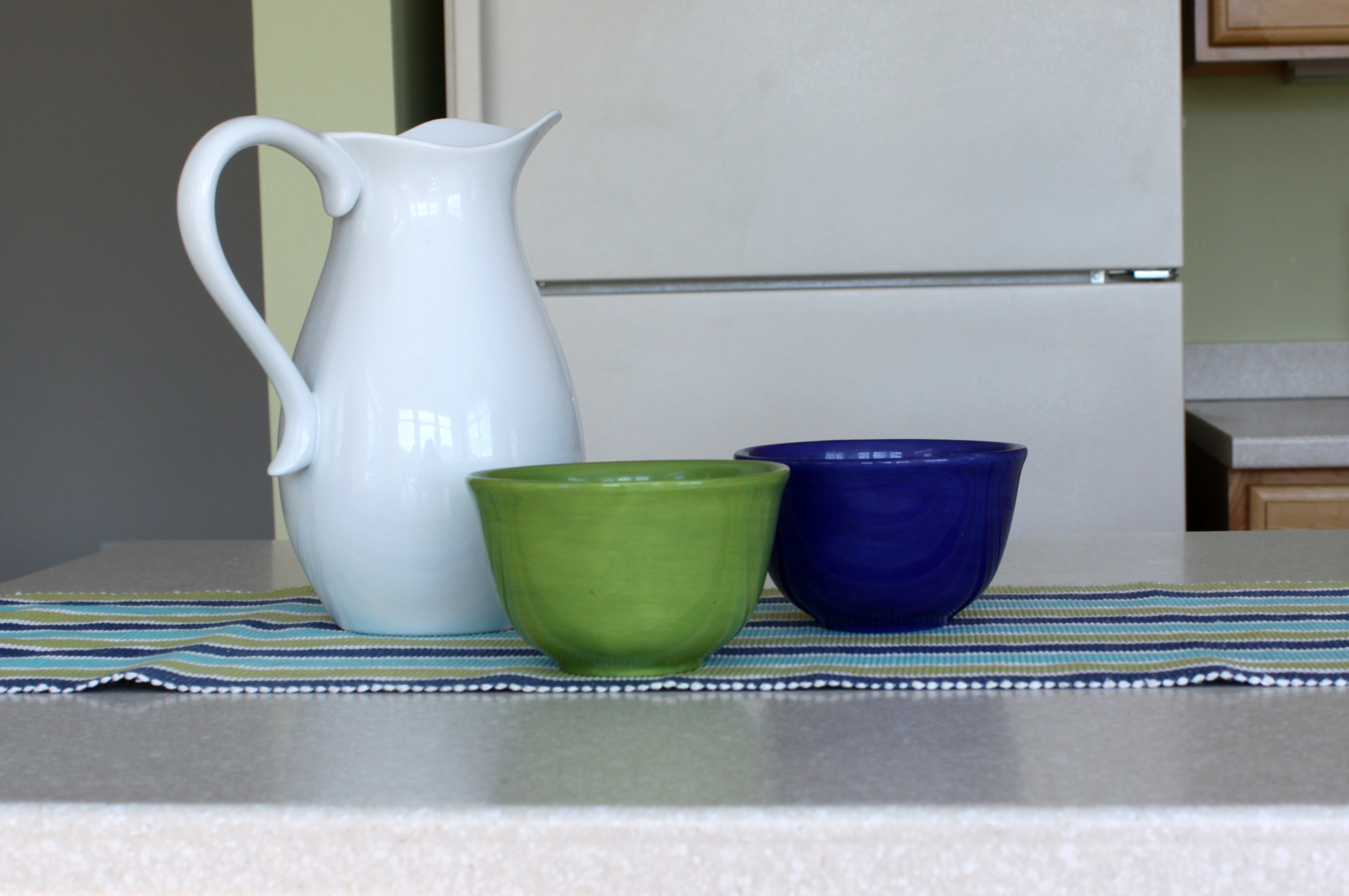
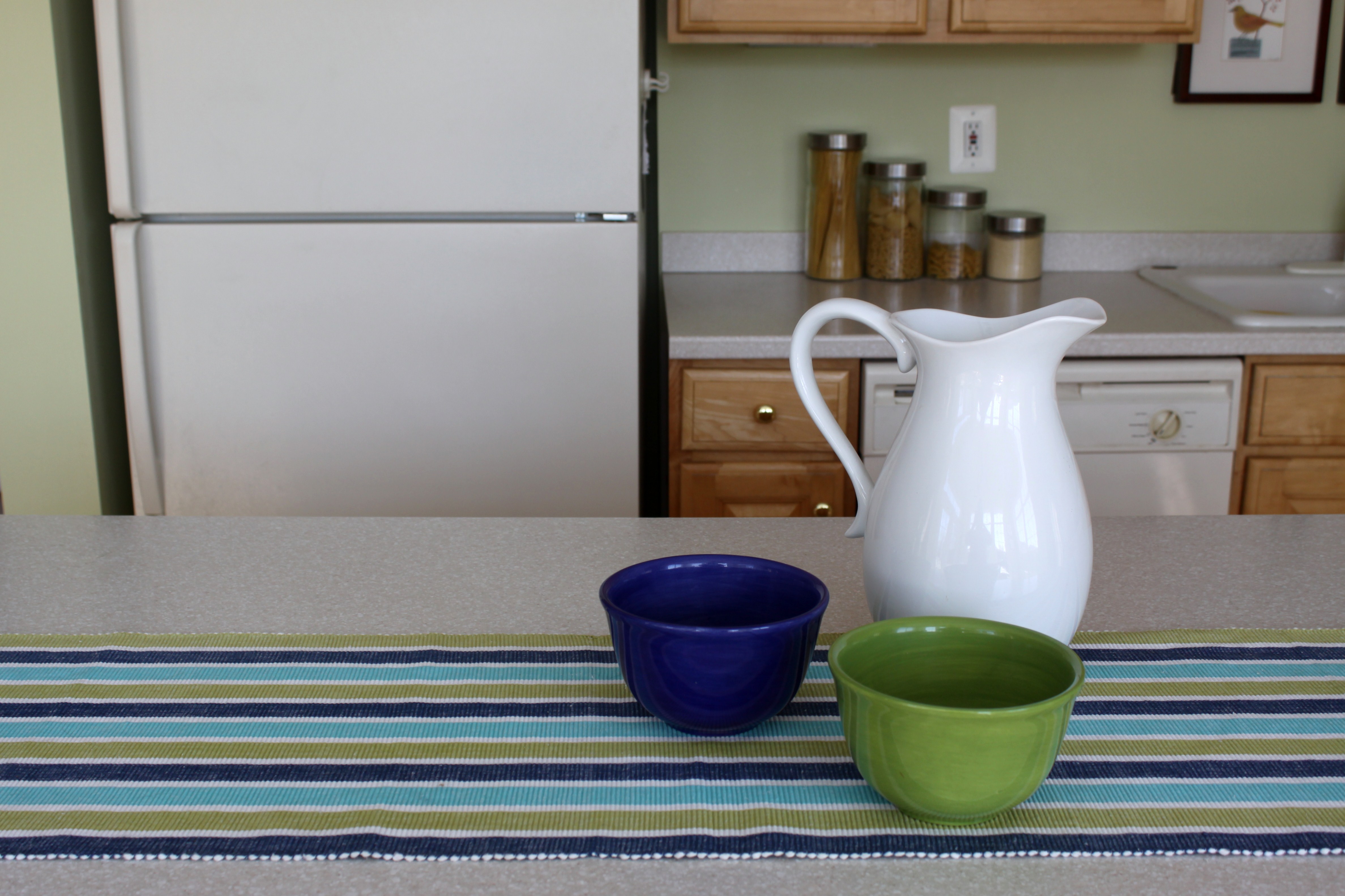
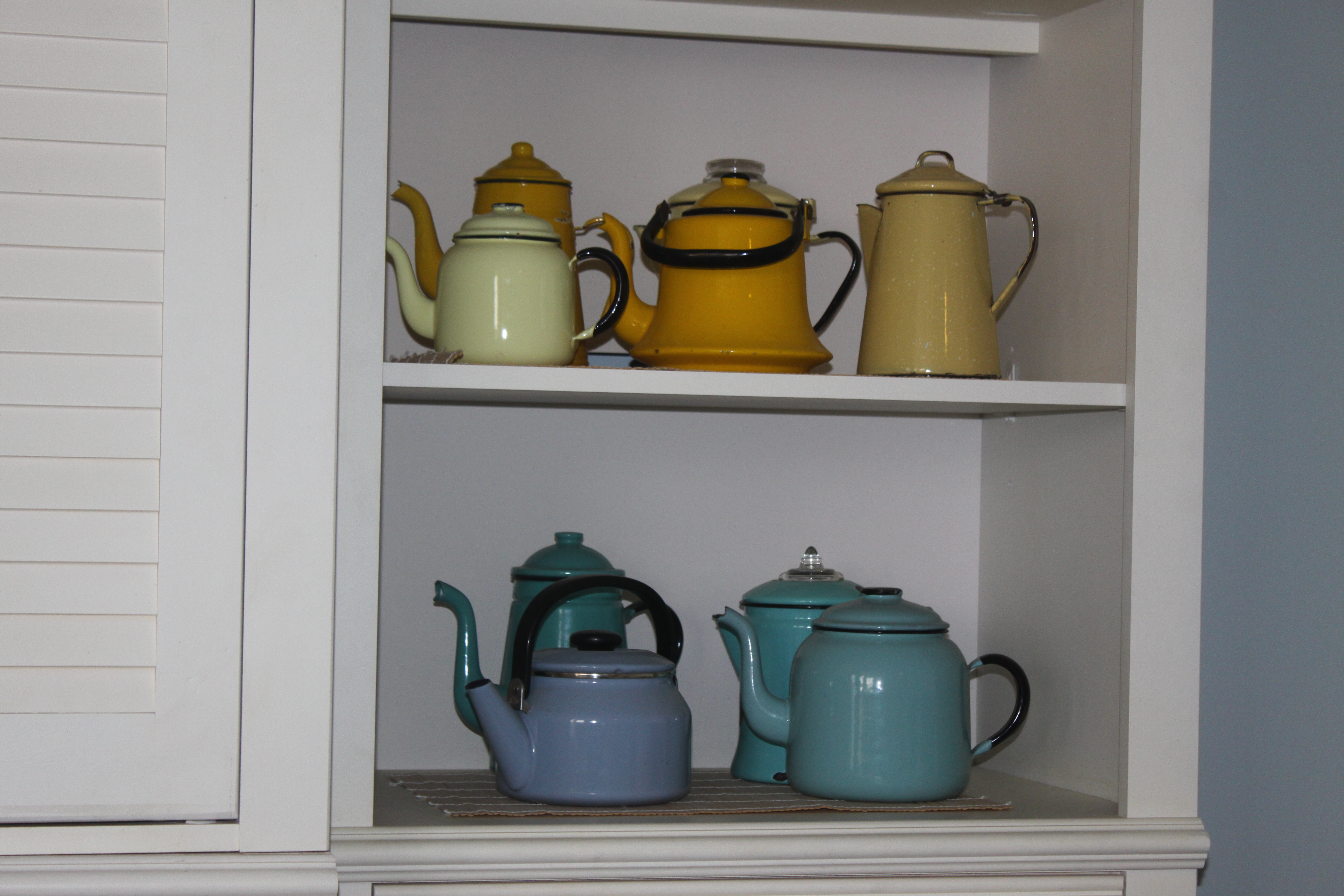
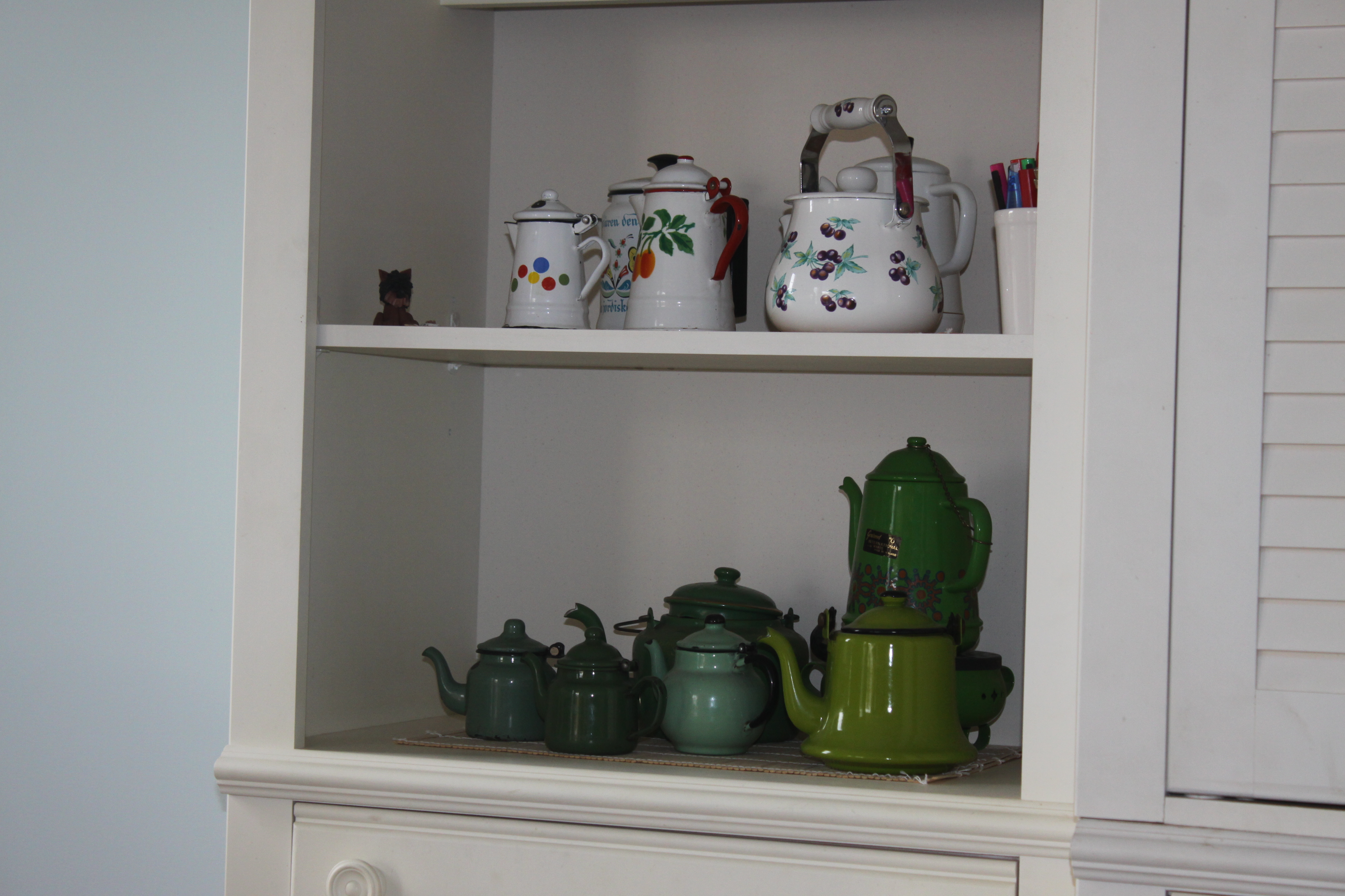
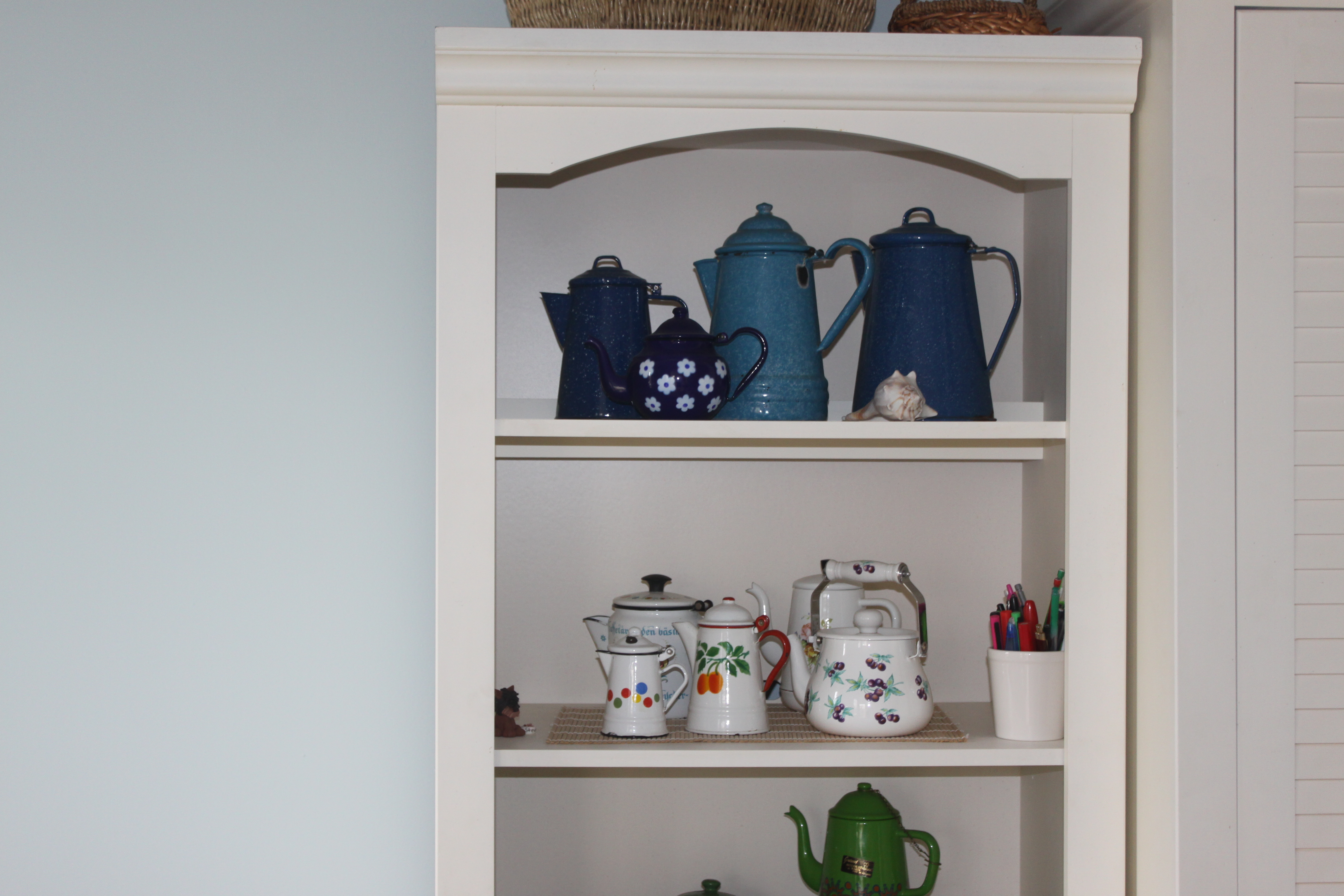
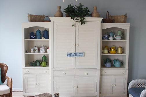
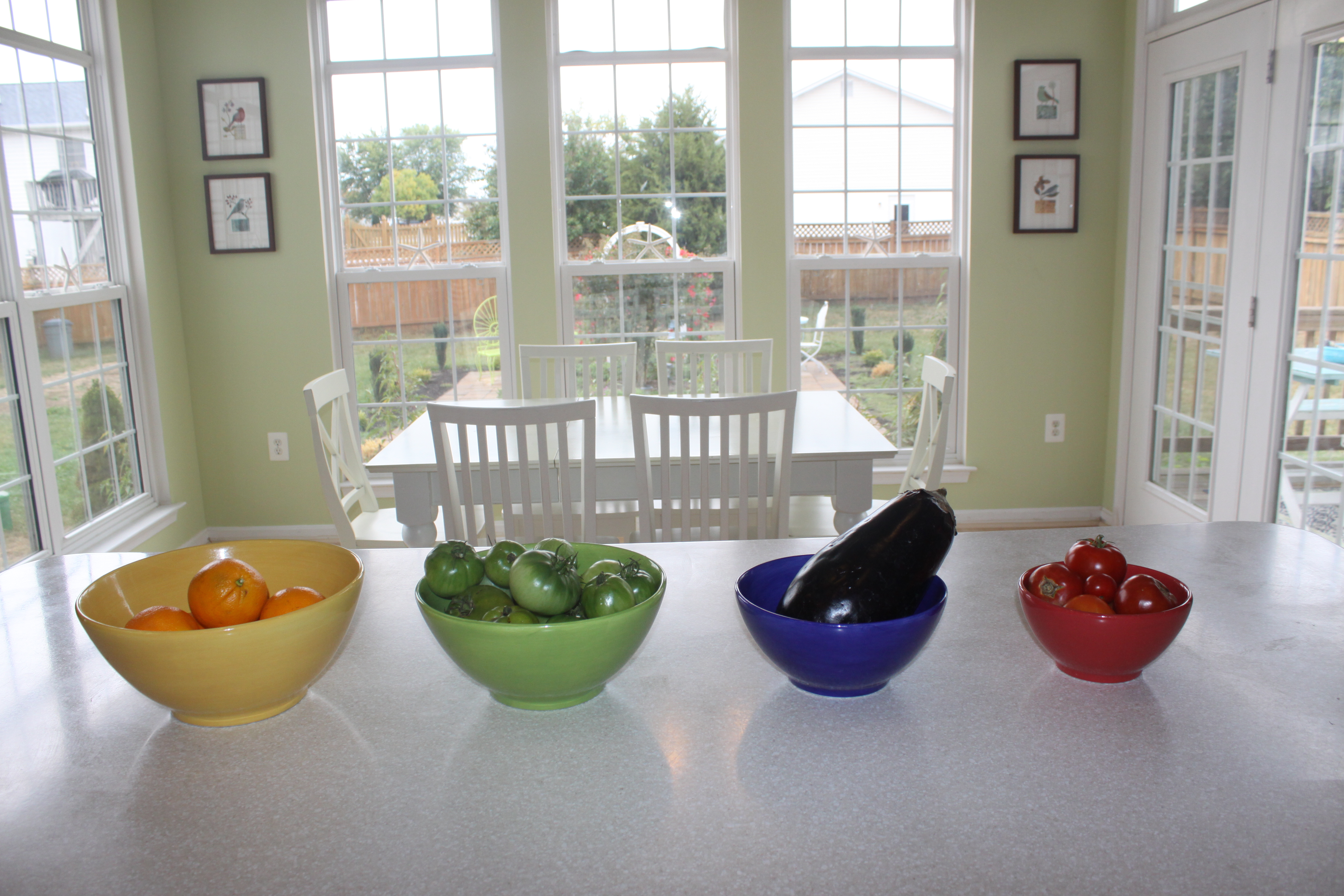
So enough of this beige bombardment already. I need color. And lots of it. My next series of posts will focus on color–lively, high saturated hues, how I’ve used them in my home, and what I used for inspiration. I hope you enjoy the show.
Like this:
Like Loading...
