Author: Jill Krafsig

Color Changes Everything–Pink and Yellow Bedroom Makeover

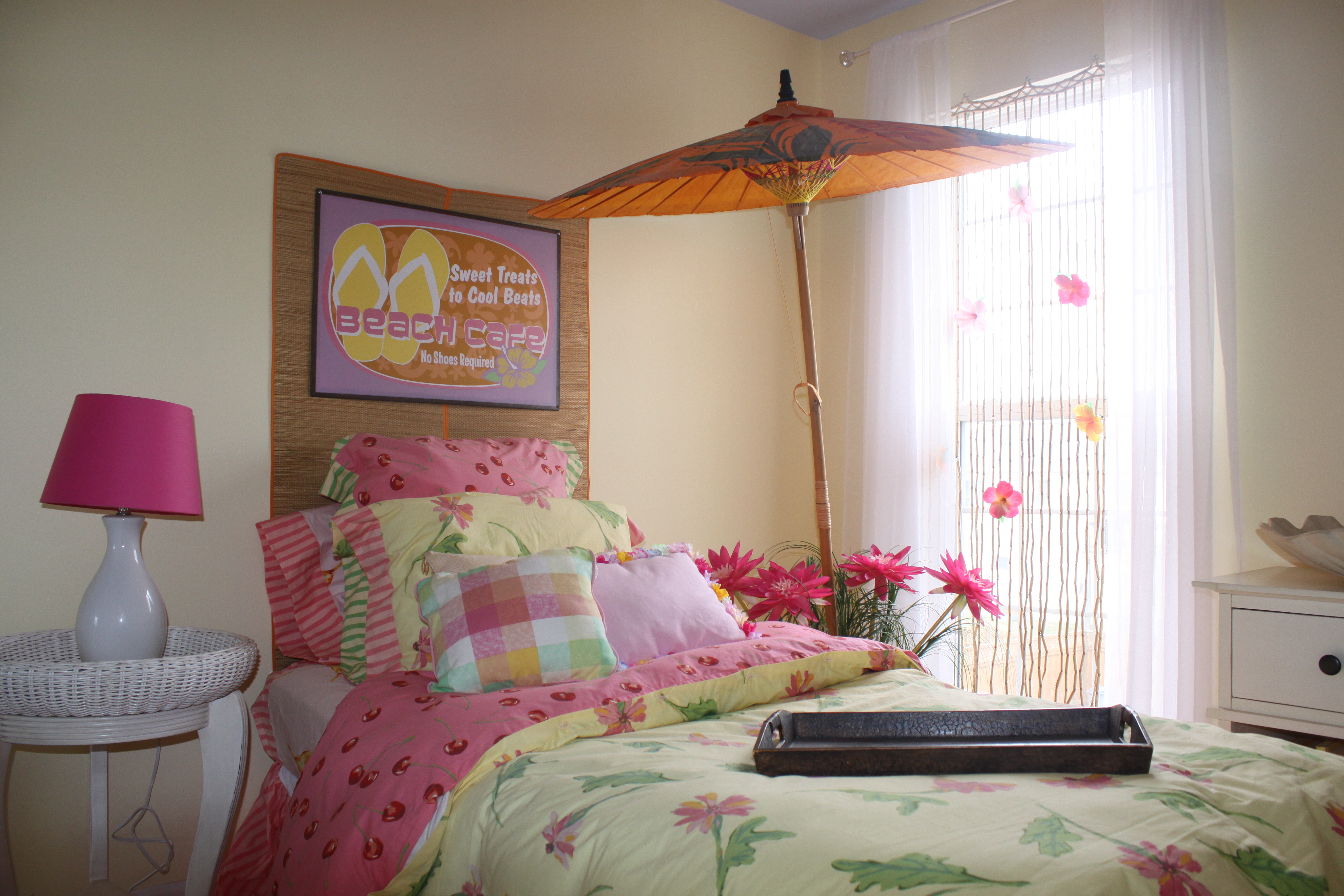
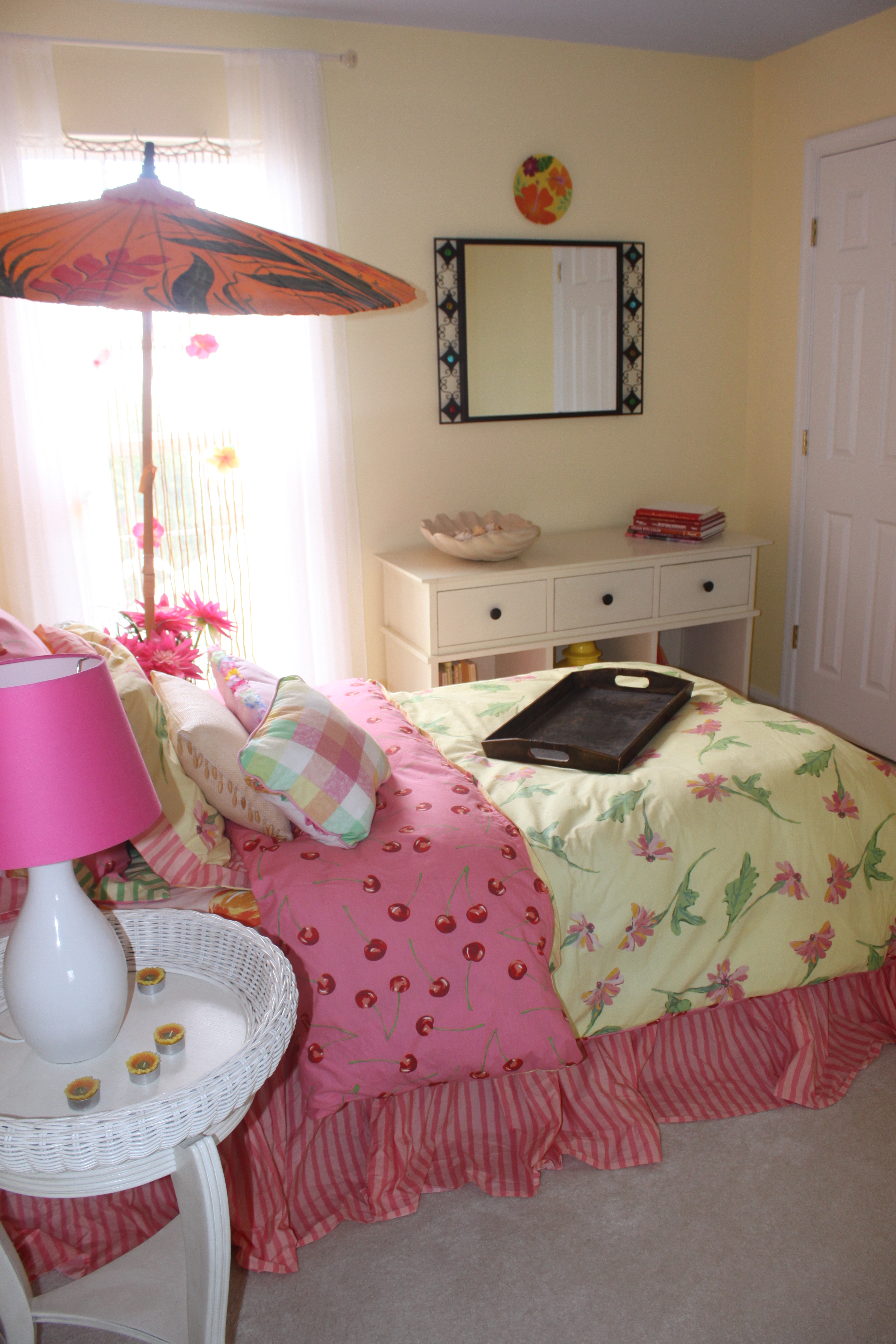
Up next on the tour is my hot pink and yellow guest room. It’s another fun beach-themed room that reminds me of summers spent at the beach. The wall color is Moonlight by Benjamin Moore paints. The ceiling color is Windmill Wings, also by Benjamin Moore paints. I used a straw beach mat as a headboard (I stapled it directly to the wall with a staple gun) and an outdoor umbrella as a canopy. To hold the canopy in place over the bed, I filled a sap bucket with sand that I brought back from the beach, sprinkled some seashells on top, added artificial tall grass that I bought at Michael’s Craft Store, and some colorful artificial flowers I bought at Pottery Barn. The school of fish is a set of plastic plates from Pier1 Imports that I hung on the wall with plate holders. The plates were $1.00 a piece, so this colorful little school of fish cost me just $5.00.

The beaded curtains, wicker chair, and wrought-iron mirror are from Pier1 Imports. The white wicker nightstand is from Lazy Boy furniture. The sheer curtains are from Target. The cute clip-on flowers on the beaded curtains are from Pottery Barn Kids. The bedspread and bedskirt are from Horchow. The pillows are from Target. The dresser is from Pottery Barn. This little room packs a lot of punch for a little money. I really love this room.
Color Changes Everything–Aqua Bedroom Makeover

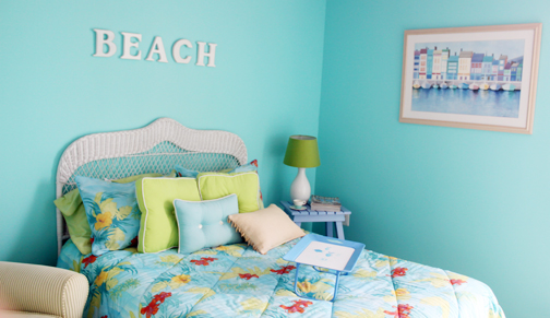
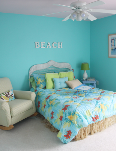
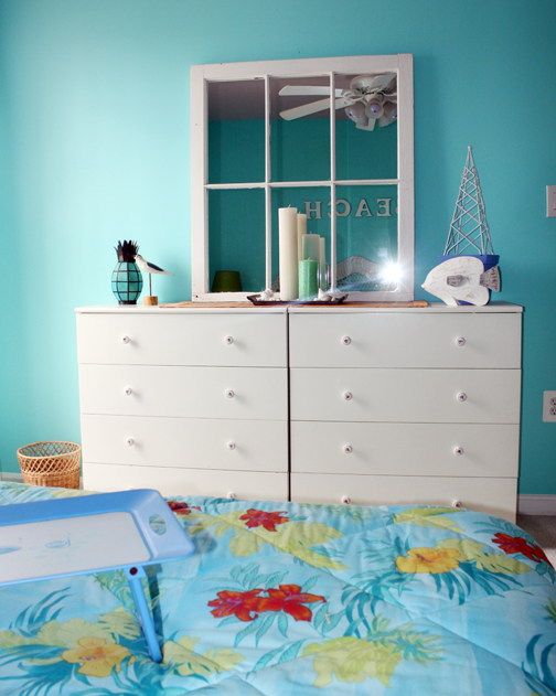
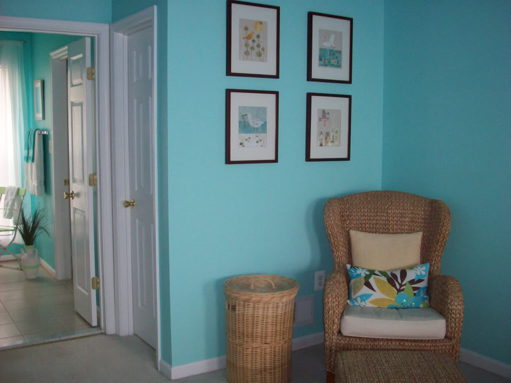
I painted the walls in this beach-themed guest room Tropical Cabana and chose Pink Cherub for the ceiling; both colors are by Benjamin Moore paints. The tropical bedspread, grass bedskirt, and pillows are from Target. The dressers are from Ikea. The mirror on the dresser is an old window I found at an antique shop and had fitted with mirrors. The beach-themed accessories are from Pier1 Imports. This room brings back lots of fond memories of summers spent at Rehoboth Beach, Delaware, with my family.

Next up on the tour is a hot pink and yellow guest room. It’s another colorful beach-inspired room that was a lot of fun to decorate.

Color Changes Everything–Aqua Master Bedroom Makeover

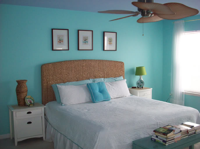
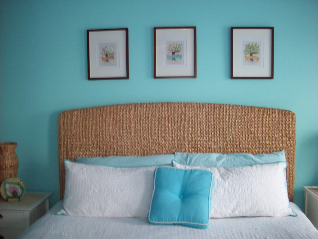
My love affair with aqua continued into two more rooms in my house–my bedroom and a guest room. And although in the photographs this color looks like the same color I used in the family room, it’s actually a lighter shade of blue (the name escapes me at the moment, and I’m too lazy go to downstairs and look it up). The ceiling color is Windmill Wings from Benjamin Moore paints.

For those who are curious, here’s a rundown of where I purchased various items in the room. The seagrass headboard, wing chair, night stand, and bench at the foot of the bed are from Pottery Barn. The white coverlet and pillows on the wing chair and bed are from Target. The plates are Majolica (more on that later).

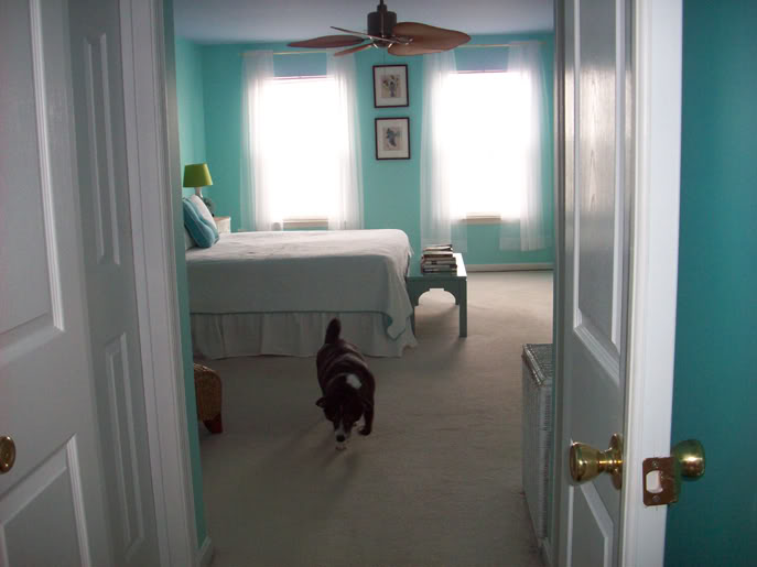
That’s my little dog, Piggy, in the last photo. My boy follows me everywhere, so he pops up frequently in my photos.

Tomorrow’s spotlight will be on my aqua guest room, then I’ll move on to another color–I promise. Here are a few pictures of my bedroom.


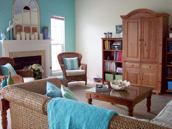
Color Changes Everything–Aqua Family Room Makeover

I’ve been on an aqua kick for the past several years and I’ve used it liberally throughout my house. It’s such a fresh, restful color, and I can’t get enough of it. I tend to use it in rooms where I like to relax and unwind, like my family room and bedroom.

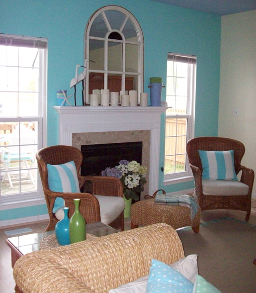
Here are a few pictures of my family room. The wall color is Forget Me Not by Benjamin Moore Paints. The ceiling color is Windmill Wings, also by Benjamin Moore. The seagrass couch and ottoman are from Pottery Barn. The indoor/outdoor rug is from Ballard Designs. The wicker chairs are from Pier1 Imports. The entertainment center, bookcases, coffee table, and end tables are from JCPenny. The blue and green vases are from Crate and Barrel. The mirror above the fireplace is an old church window that I bought at an antique store and had fitted with mirrors. I liked the old, chipped paint so I left it undisturbed. Come to think of it, that mirror may be the only thing that I haven’t taken a paint brush to. Well, there’s always tomorrow.

Coming up tomorrow on the tour–my aqua bedroom.

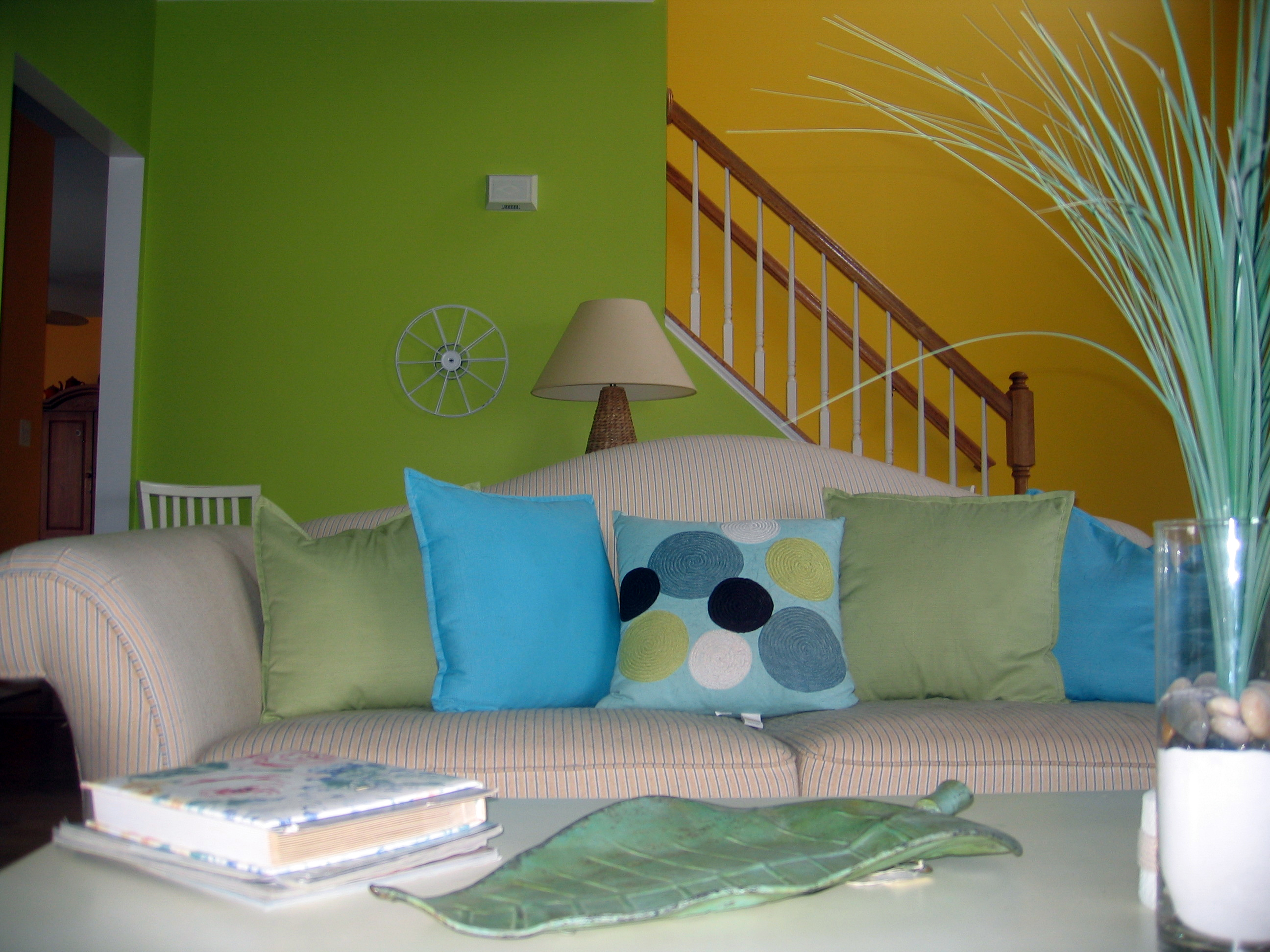
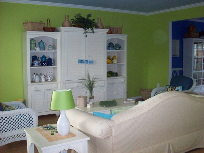
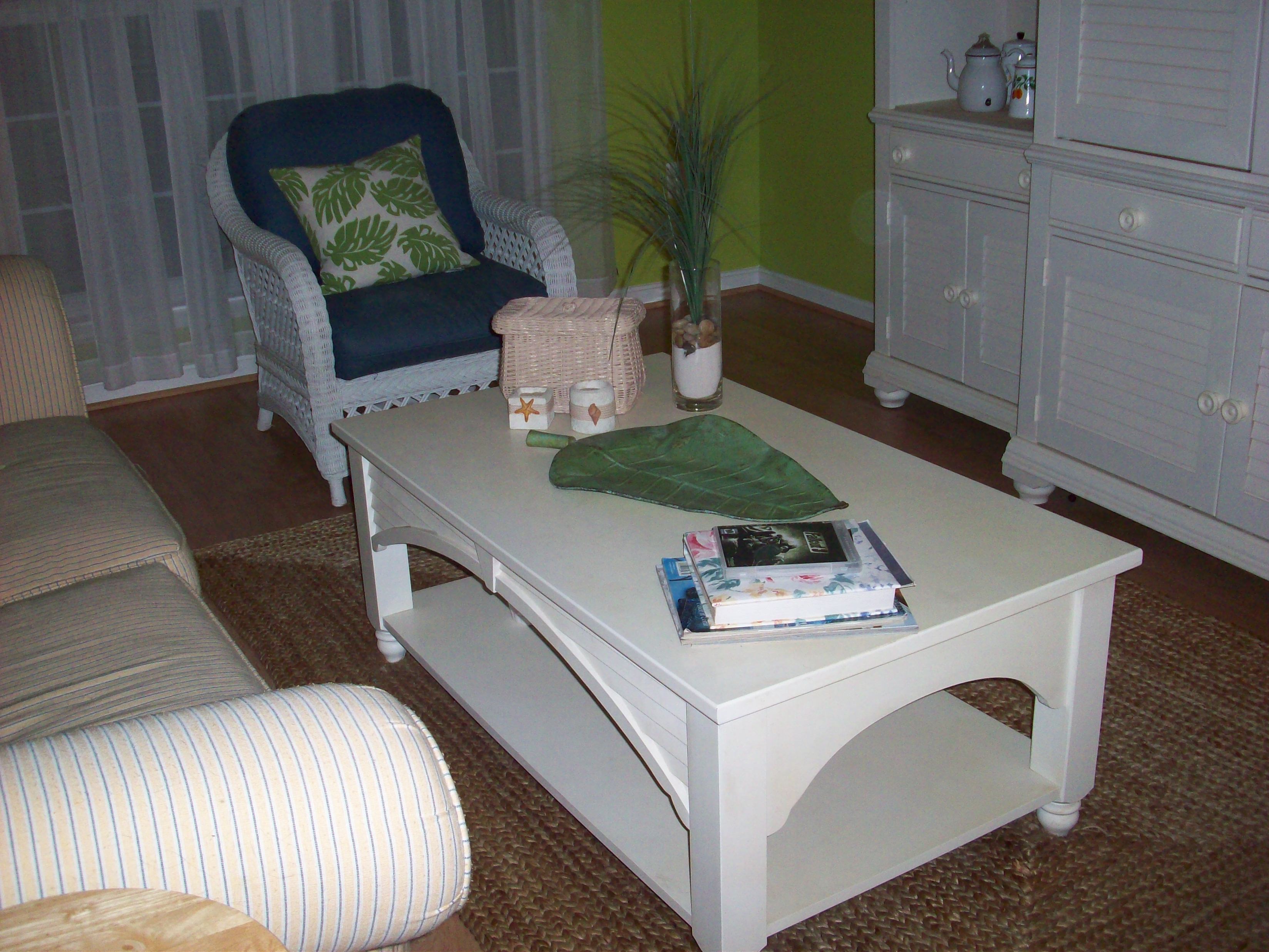
Color Changes Everything–Lime Green Living Room Makeover

Next up on the tour is my lime green living room. I love the combination of the fresh green walls and stark white furniture. The wall color is Pear by Benjamin Moore Paints. The ceiling paint, which you can barely see in the second photo, is Windmill Wings also by Benjamin Moore. The woven rug and seagrass lamp are from Pottery Barn. The camel back sofa, white entertainment center, bookshelves, and tables are from Lane Furniture. The white wicker chairs are from Lexington Furniture. The green and white lamp, pillows, and sheer curtains are from Target.

Stop in tomorrow for a peek at my aqua family room.

Color Changes Everything–Royal Blue Dining Room Makeover

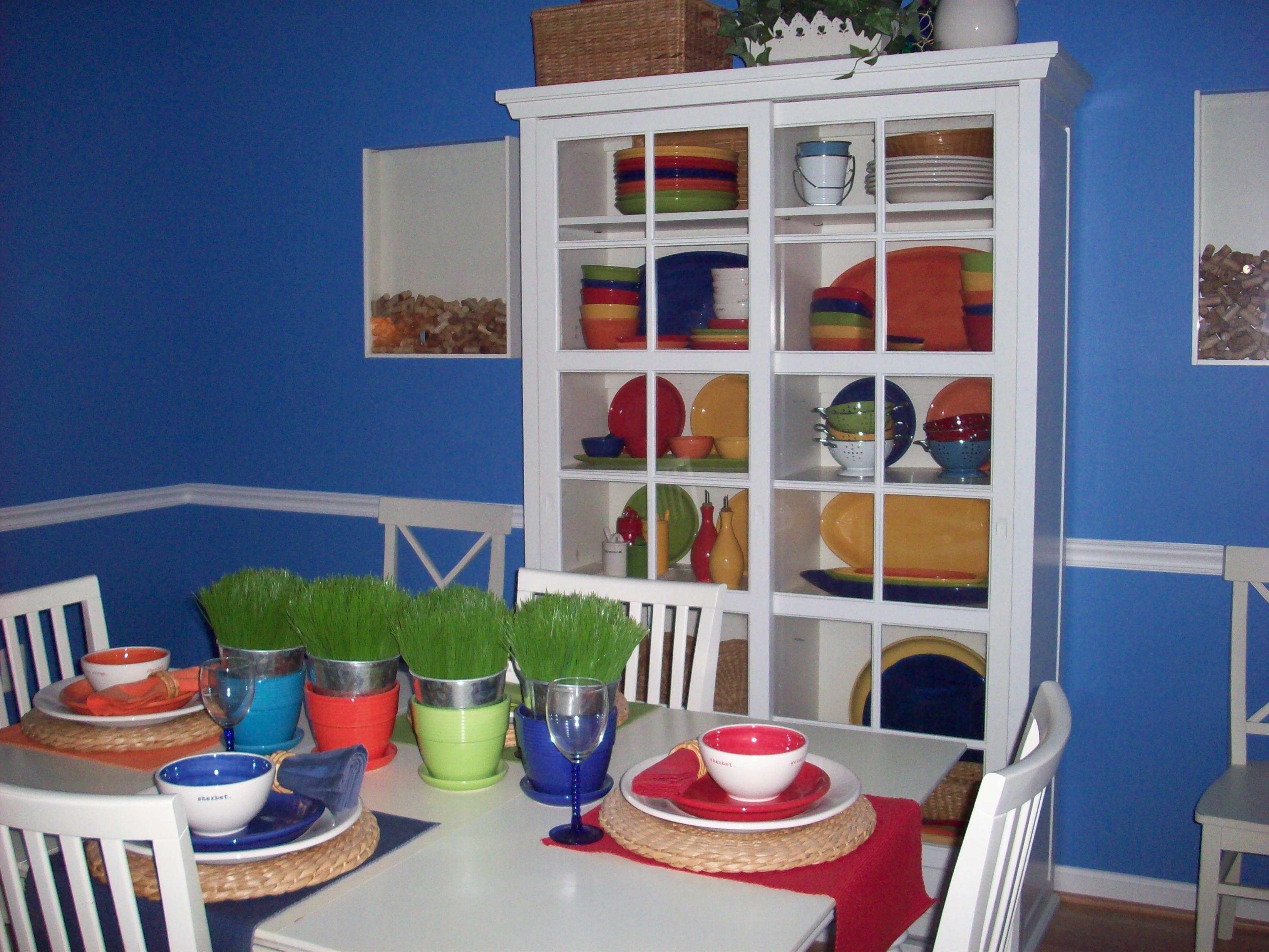
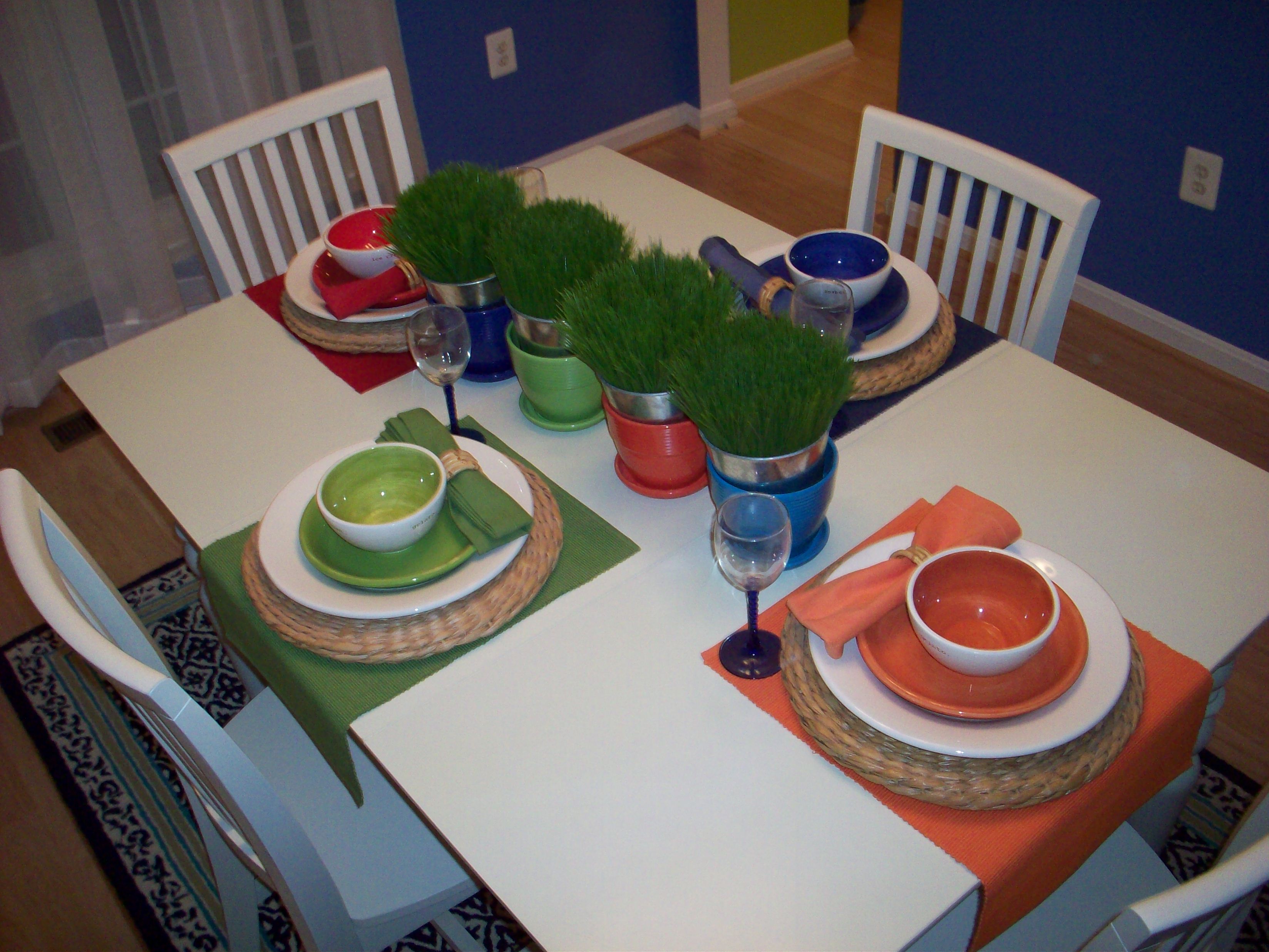
I’m going to start the tour in the dining room because that’s where my inspiration pieces (the four colorful pots I posted about yesterday) took up residence. I’ll show you some photos and then give you a rundown on where I purchased various items and, of course, provide the name of the fabulous paint.

For this decorating project I chose a high-contrast color scheme. I love the combination of highly saturated walls offset with white furniture.

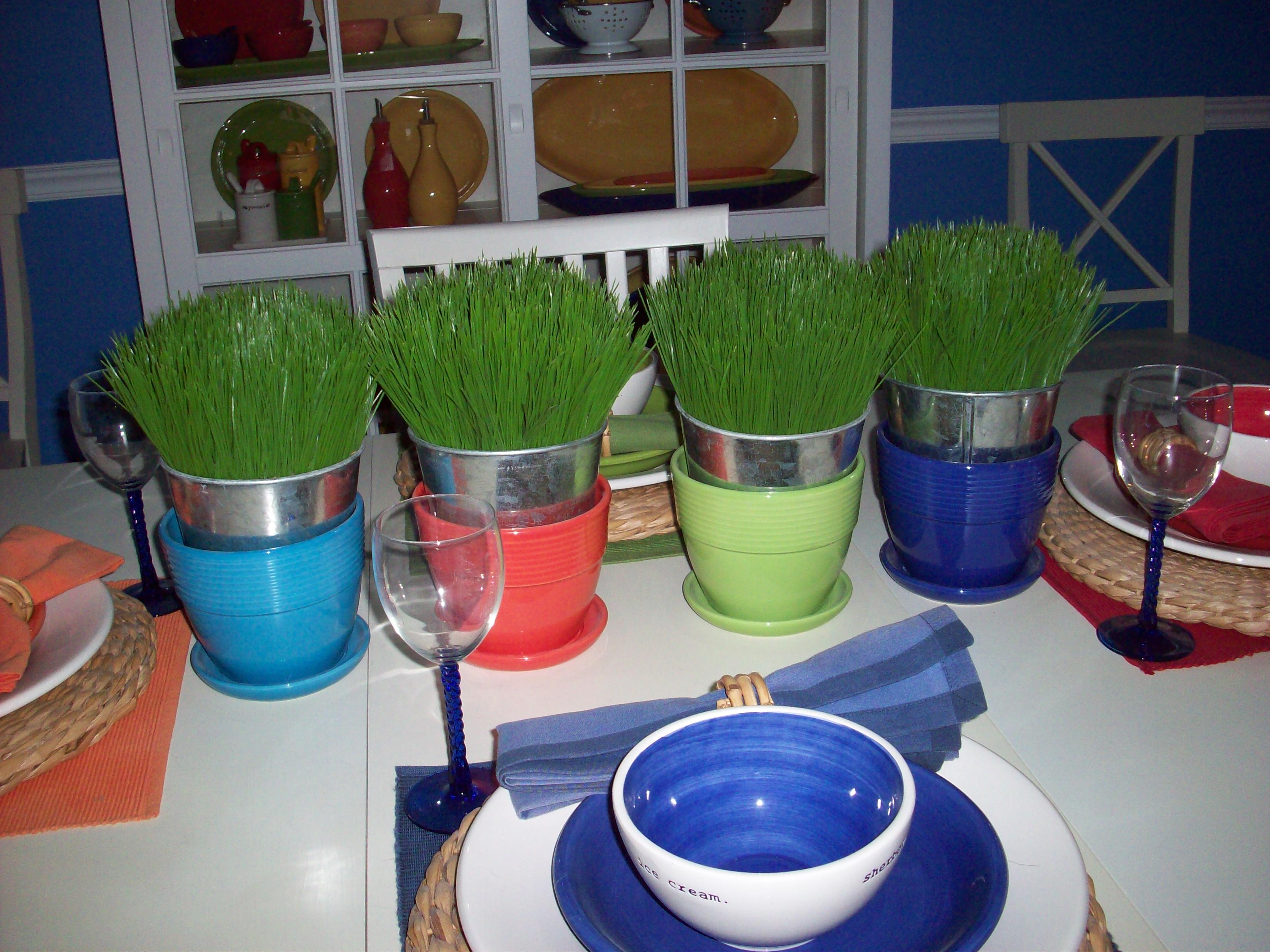
With the exception of the pots on the center of the table, I purchased everything in this room at Pottery Barn (Garrison glass cabinet, dining table, Carolina adult chairs, seagrass placemats, aluminum pots of grass, and dishware). The glass cabinet is filled with a collection of Pottery Barn Colorful Serve pottery. I couldn’t resist the fabulous colors and awesome serving pieces in that collection. I painted the walls Blue Lapis and the ceiling Windmill Wings–both colors by Benjamin Moore Paints.

Coming up next–a lime green living room. Check back tomorrow to continue the tour.

Color Changes Everything–Colorful Home Makeover Idea Starter

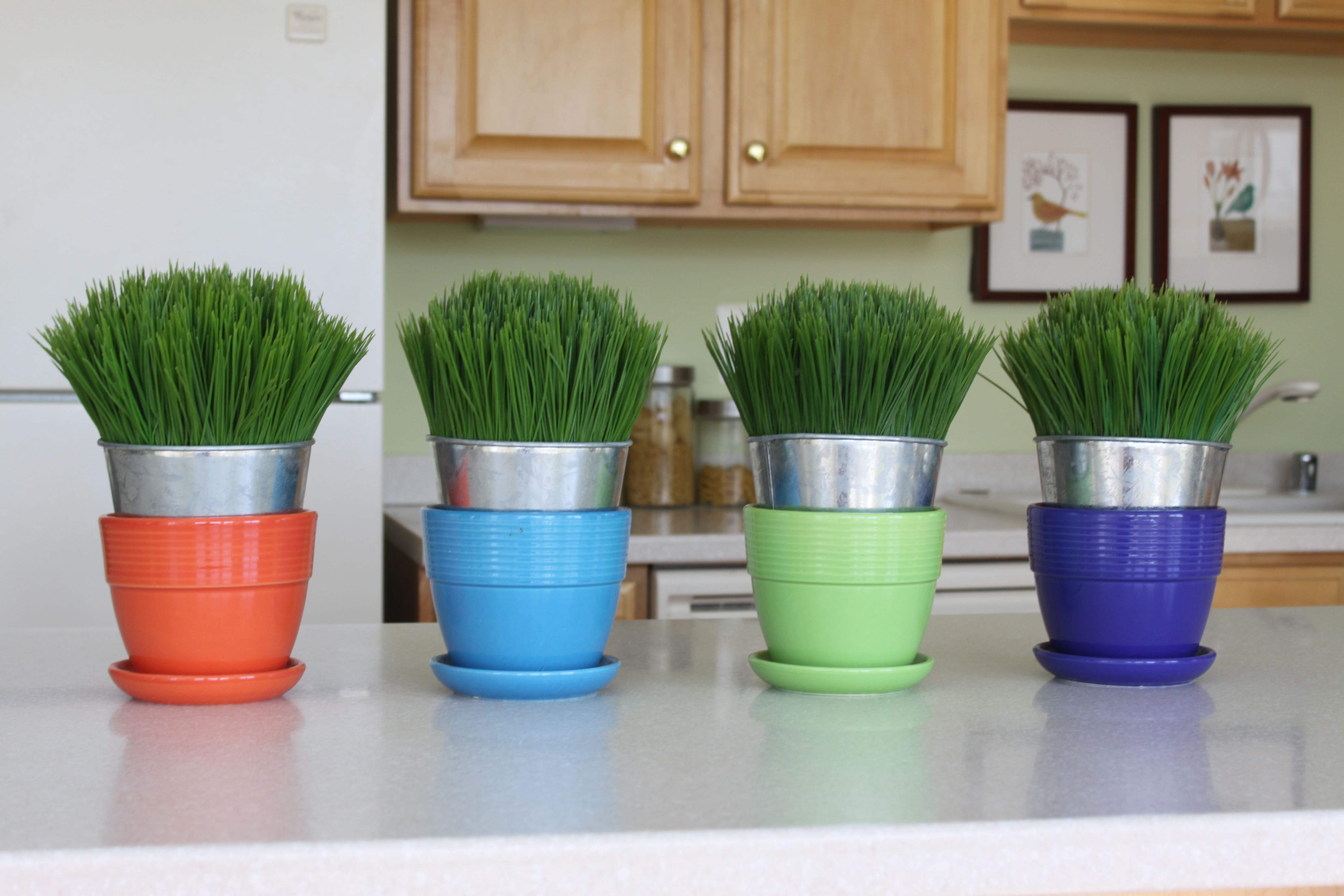
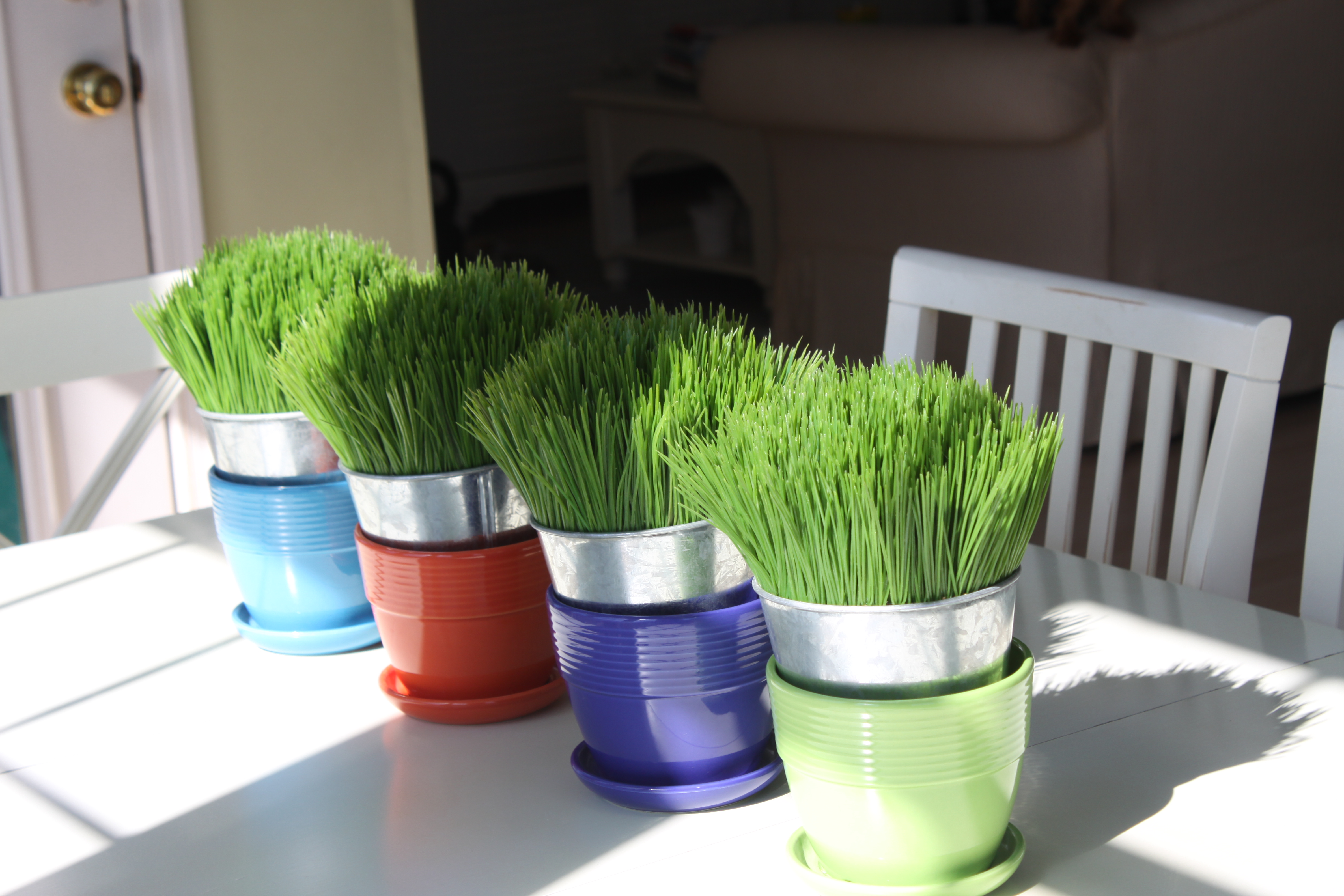
It all started with four colorful pots that my mom bought for me at Rehoboth Beach a few years ago. I was so taken by these $2.00 pots, the simplicity of their design, and their vibrant hues that I decided to use them as my inspiration and design a room around them. Did I say one room? No, wait, make that my entire home. Yes, you heard that right, I designed my entire home around these four pots.

Sounds crazy, right? But wait until you see the results. In my “Color Changes Everything” series, I’m going to take you on a tour of my home–room by room–and show you how a little color, or sometimes a lot of color, changes everything. Hang on to your seats, this is going to be a colorful ride.

But first, I’m going to show you the inspiration pieces–$8.00 worth of pottery (the cute grass is from Pottery Barn).

Step Away From the Beige and Nobody Will Get Hurt

Every decade has unique interior decorating trends: the 60s had flower power, the 70s had shag carpeting and appliances in avocado green or harvest gold, the 80s were pretty in pink (remember pink wall-to-wall carpeting?), the 90s had minimalism, and the 2000’s and beyond had beige–ugh. For the love of beige, I just don’t get it. Who wants to surround themselves with this drab, non-color? It doesn’t get any more boring, depressing, or predictable than beige. For the last 10 years, open any decorating magazine or interior design book and all you’ll see is page after page of beige rooms. You’ve seen one beige room, you’ve seen them all.

I got so frustrated with this bombardment of beige that I stopped subscribing to decorating magazines. I’ve been waiting for the tides to wash in and color our world in delightful hues once again. Yes, I know that beige is considered a safe, tasteful choice. But who convinced American consumers that beige is tasteful? Retail stores, that’s who. It’s more economical and profitable for retailers to mass create furniture and accessories in neutral tones and convince consumers that this is the epitome of good taste. But who wants their home’s interior to resemble the home next door or the home down the street? Not me.

So enough of this beige bombardment already. I need color. And lots of it. My next series of posts will focus on color–lively, high saturated hues, how I’ve used them in my home, and what I used for inspiration. I hope you enjoy the show.

Simple Design is the Best

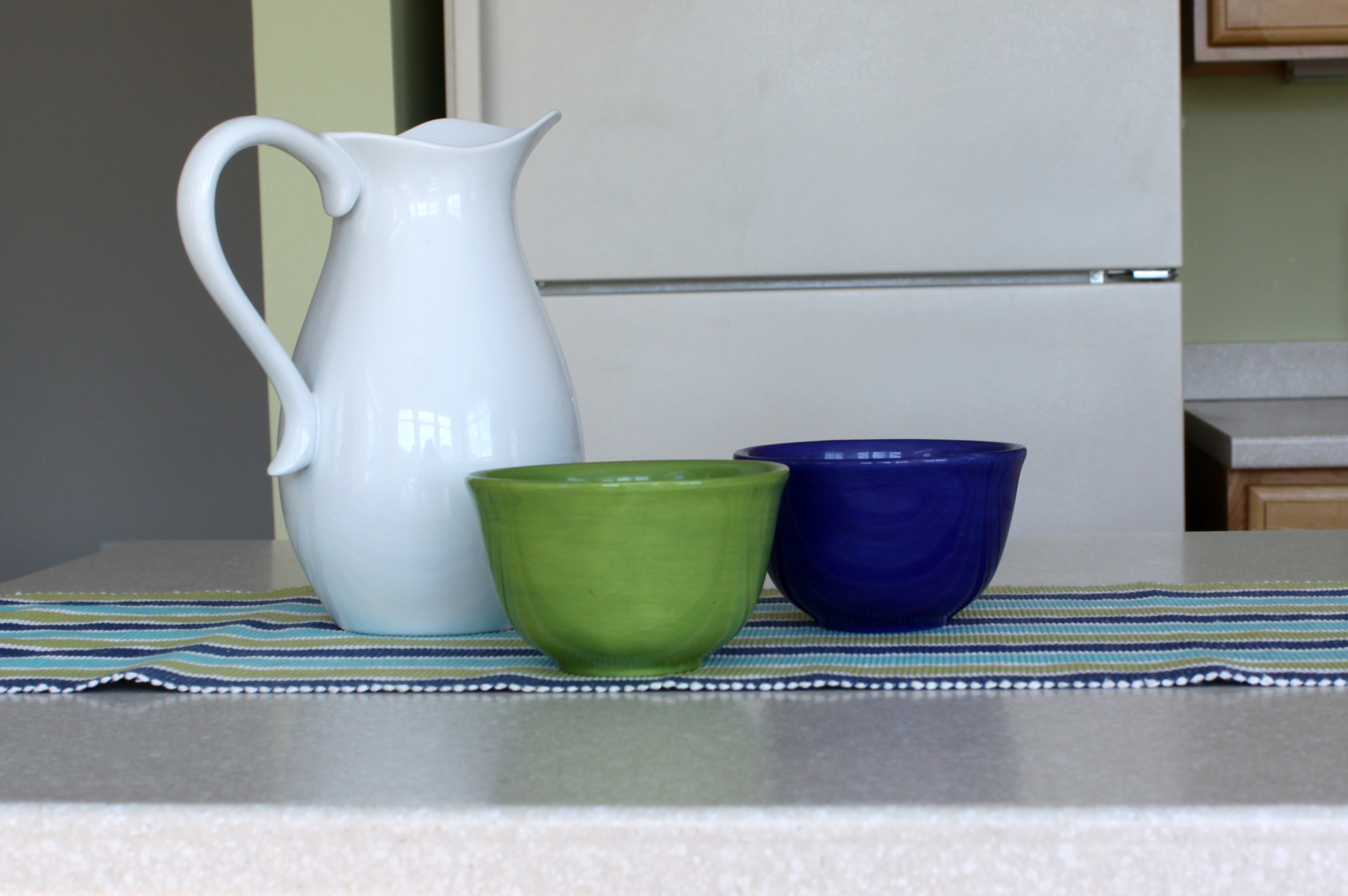
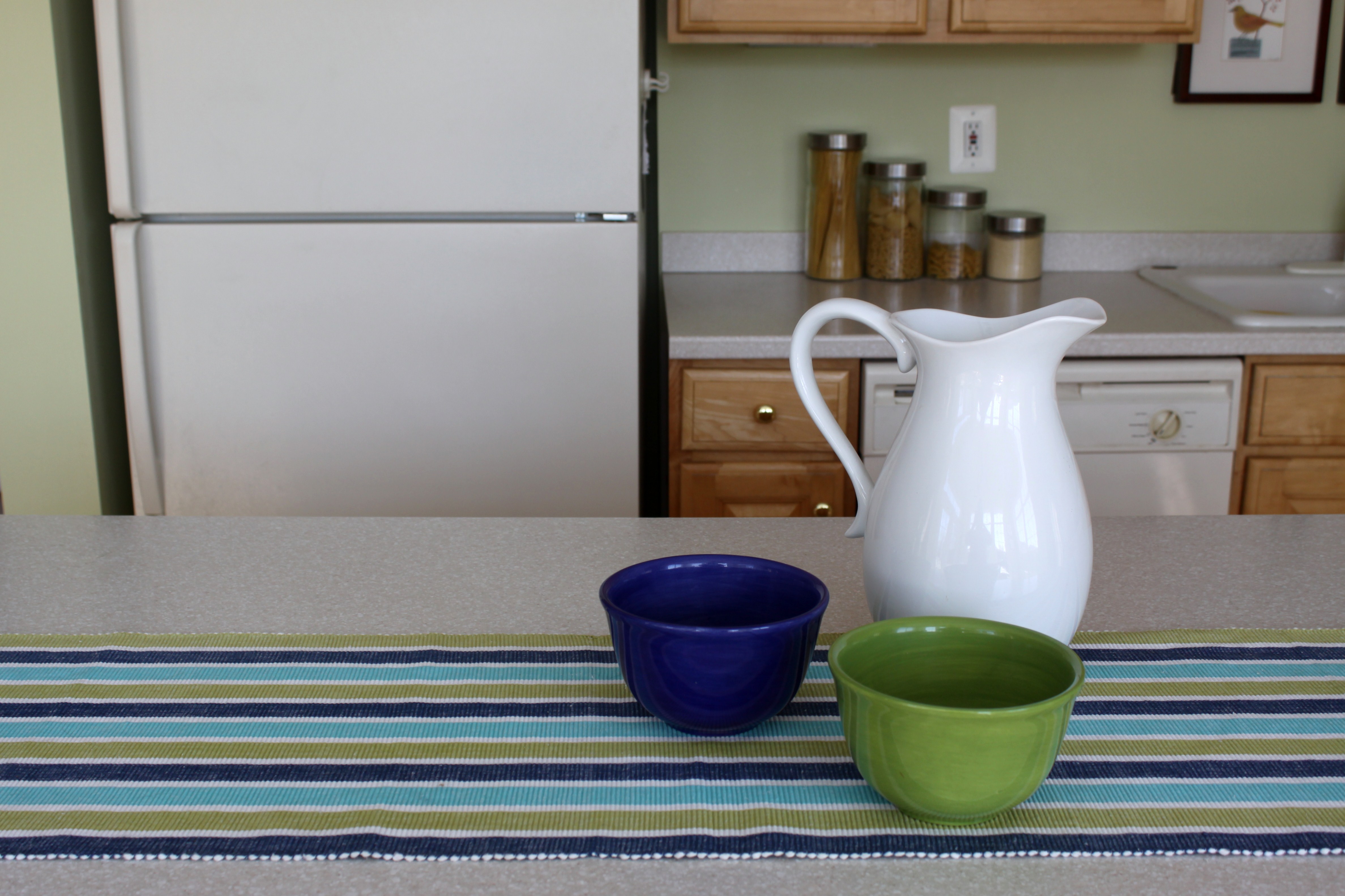
There’s beauty in simplicity and detail in the lack thereof. Sometimes it’s best not to over think things, or over design them. This plain white pitcher from Target’s new White Dinnerware line and simple colorful bowls from Pottery Barn’s Colorful Serve collection make a delightful display when left to shine on their own. Beautiful pottery doesn’t have to be fancy, or costly.

%d bloggers like this: