I couldn’t wait to share this rainbow dragon that my daughter painted today. I love the colorful scales paired with the neutral gray tones; it creates a wonderful balance of cool and warm colors that helps guide viewers’ eyes around the painting. This painting is an interesting play of contrasts: its whimsical and sophisticated, colorful and subdued, patterned and random. What’s not to love?
Tag: fantasy illustration
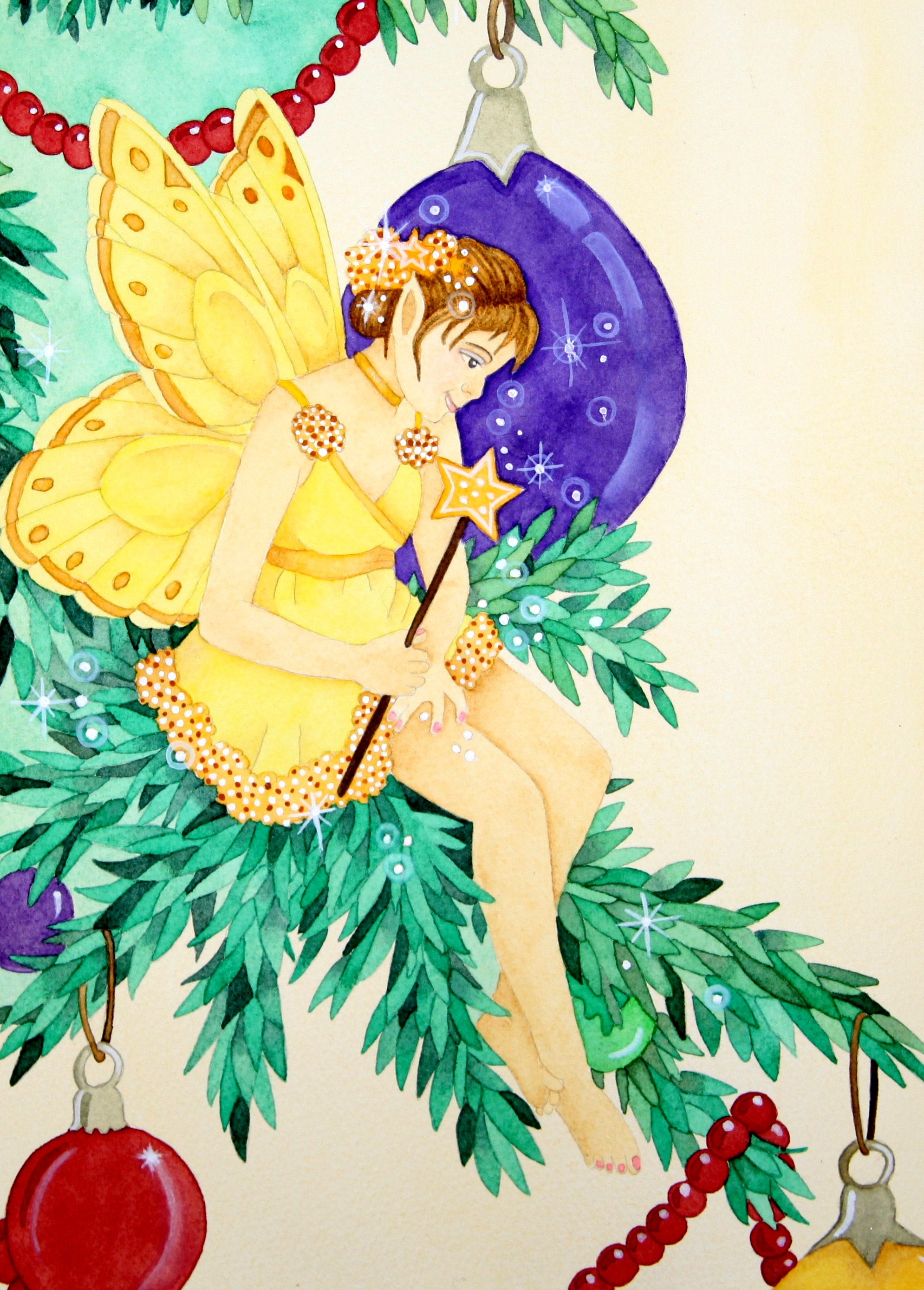
Holiday Fairy
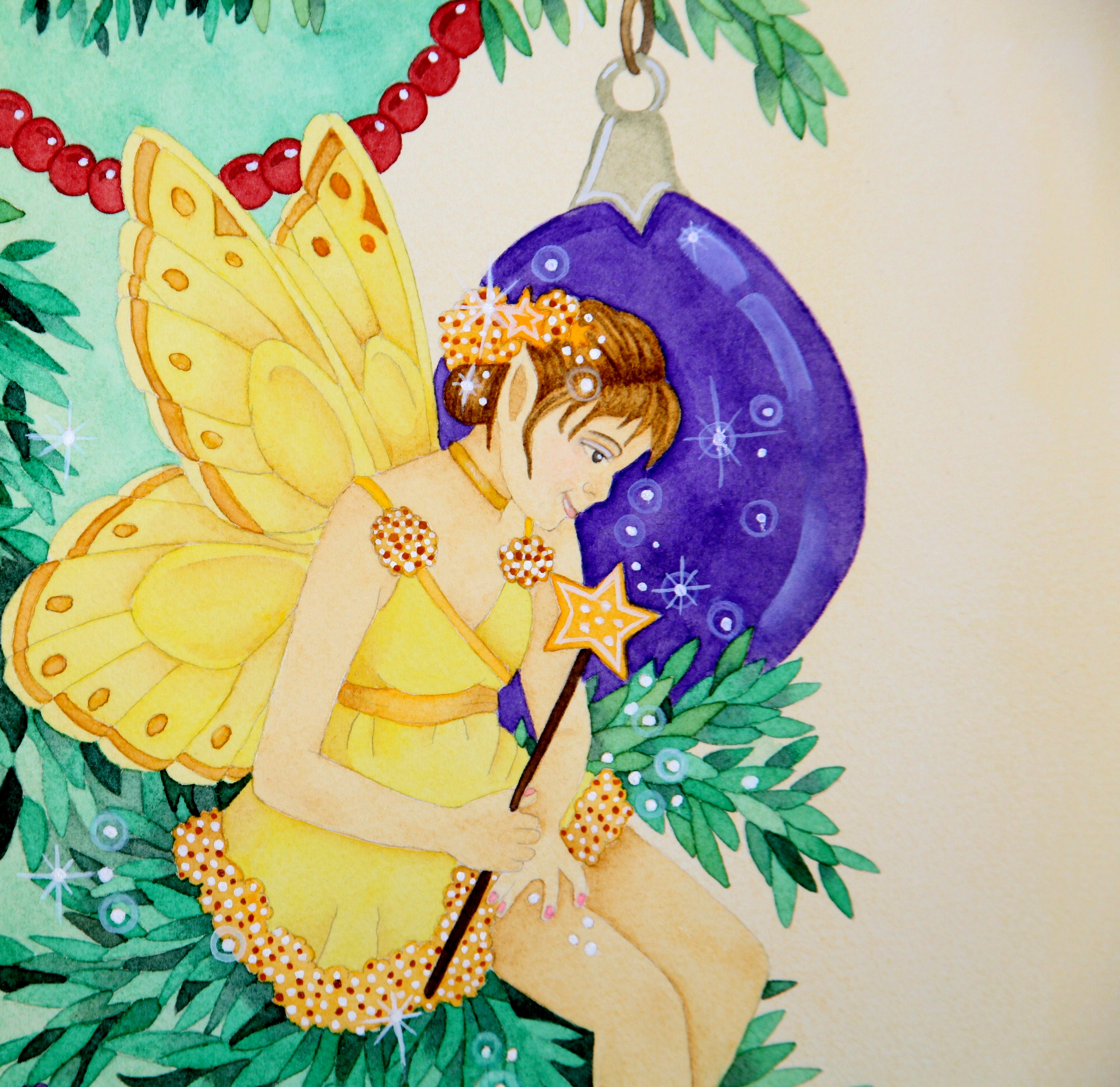
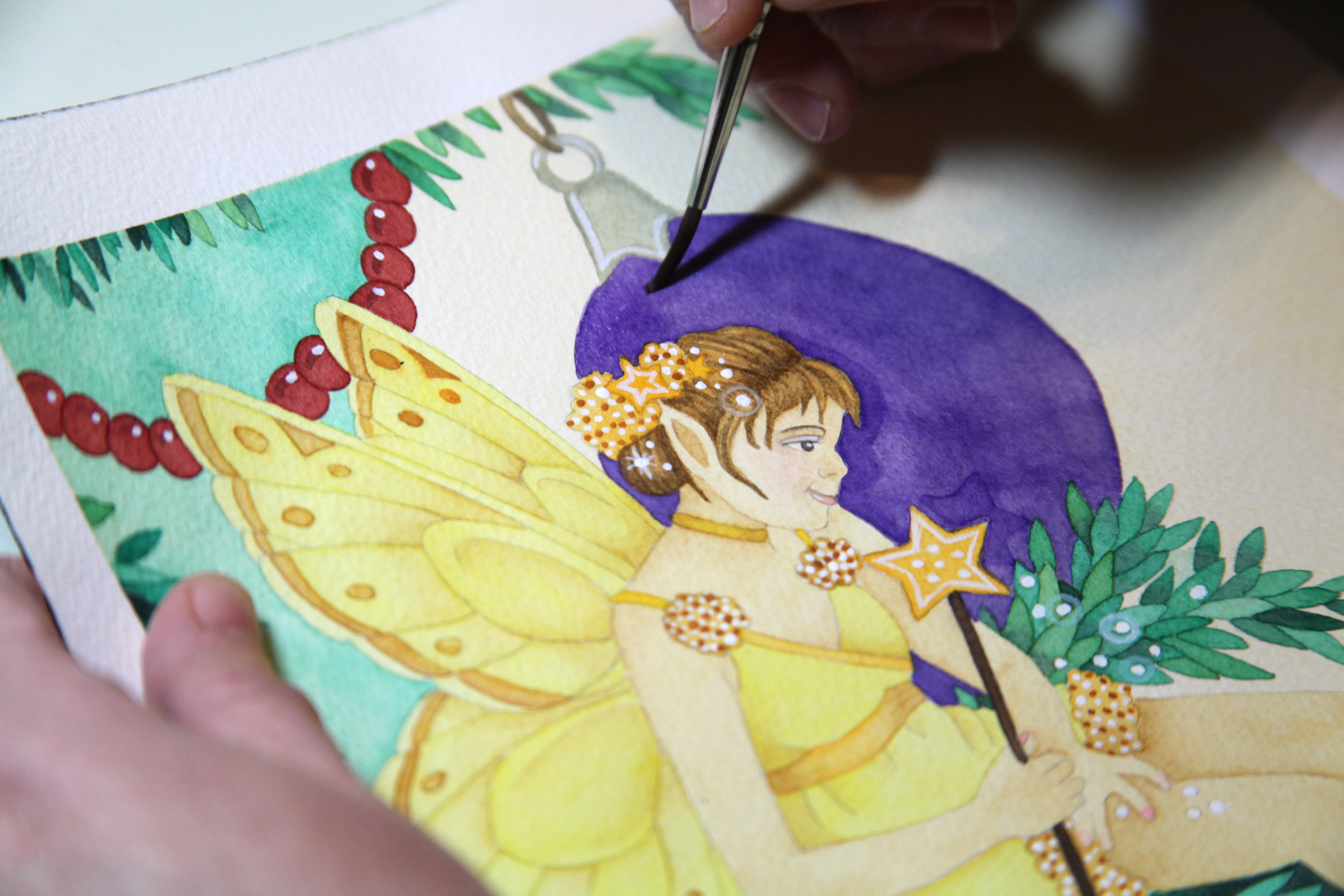
I started work on this painting two weeks ago in hopes of posting it on Christmas day but with all the hustle and bustle of the holidays–shopping, wrapping gifts, baking, and hosting visits with family and friends–I wasn’t able to complete it until today. This little holiday fairy proved to be more time consuming than I anticipated. Oh well, better late than never. Besides, the holidays aren’t officially over until New Year’s Day, right?
This painting is based on a tutorial featured in Linda Ravenscroft’s book, “The Fairy Artist’s Figure Drawing Bible.” Here are some close up shots of my painting. I really enjoyed painting her and working with such vibrant colors.
My Niece’s Leaf Fairy
My niece Jenny chose to paint the same leaf fairy that I painted several weeks ago. Her painting style is so similar to mine that it’s nearly a ringer for my painting. Can you believe that this is Jenny’s first attempt at painting? This painting is based on a tutorial in Linda Ravenscroft’s book, “How to Draw and Paint Fairies.”
Here’s a close up of Jenny’s painting:
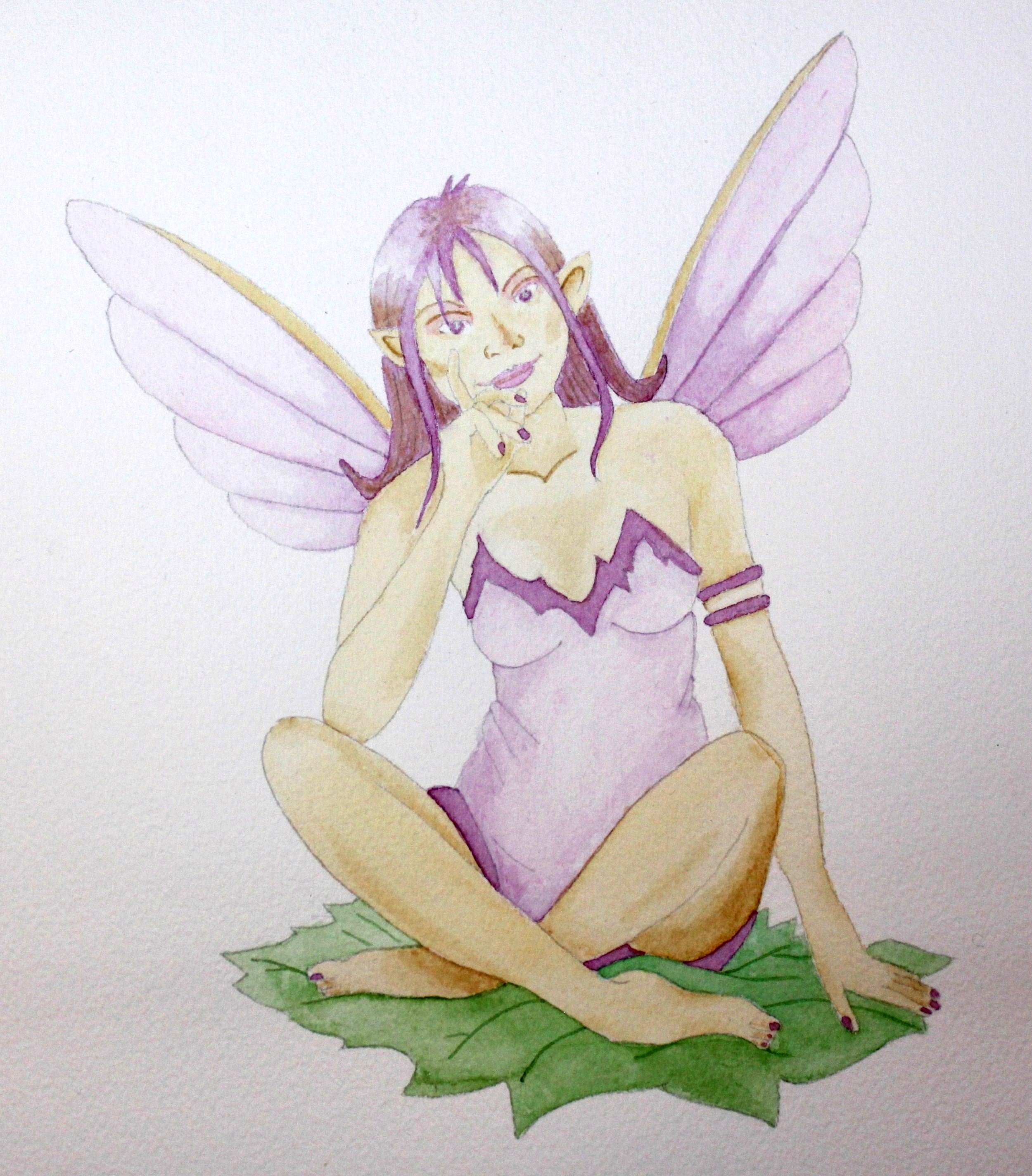
Purple Fairy in Watercolors
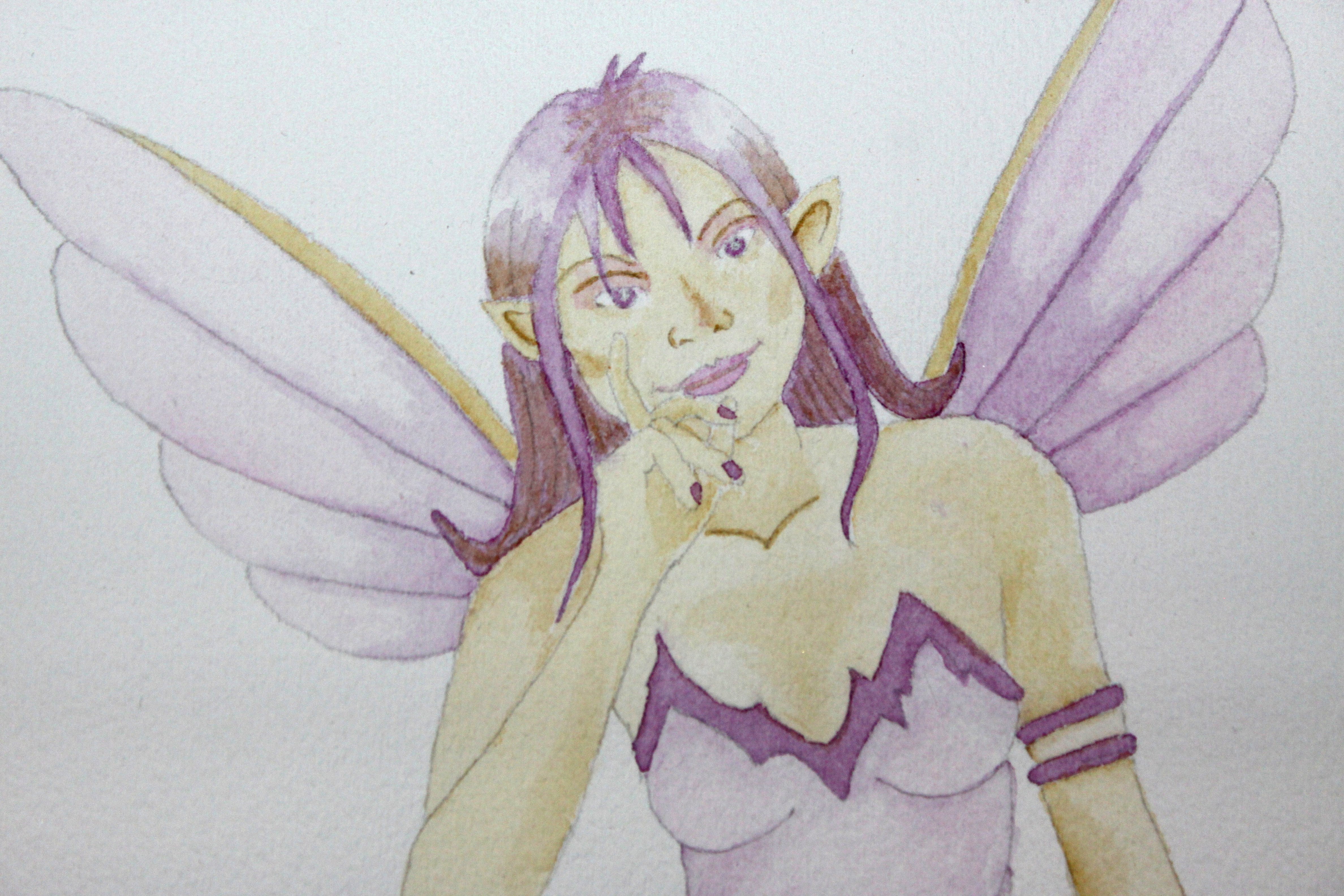
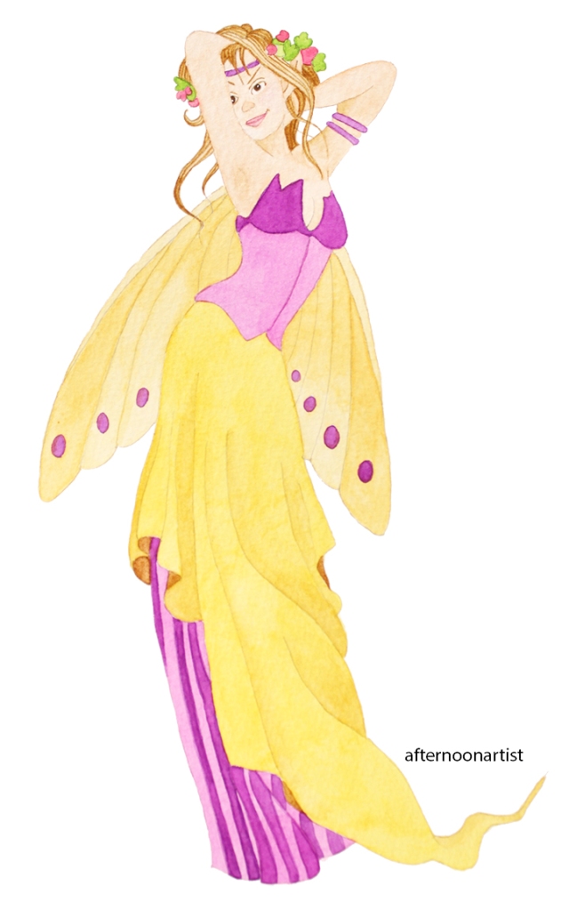
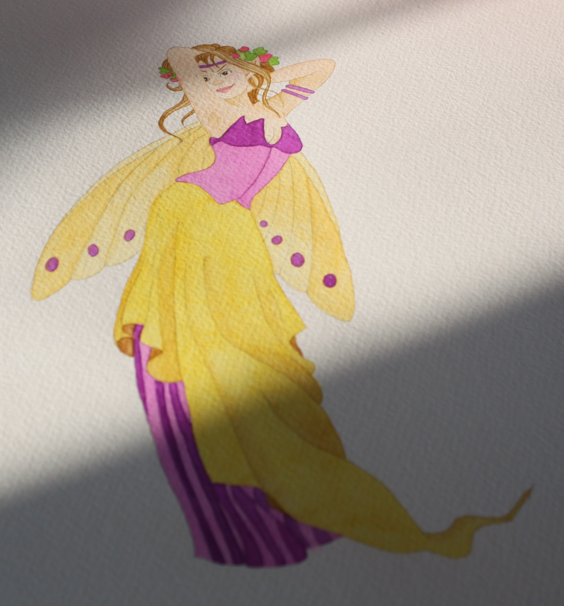
My niece asked me to paint another fantasy illustration, so this one’s for you Jenny. This painting is based on a tutorial from “How to Draw and Paint Fairyland,” by Linda Ravenscoft. My palette consisted of alizarin crimson, opera rose, new gamboge, naples yellow, and raw umber from Winsor Newton; brilliant red violet and may green from Schmincke (I’m really loving this brand of paint); and jaune brilliant no. 2 from Holbein (this makes great skin tones).
Here’s a close up of her face (I like how you can see the texture of the paper in this shot):
And here’s a shot with the natural, late afternoon light in my studio (I like this one best):

