Remember the Kenwood KMIX mixer in Firecracker Red that I purchased a few weeks ago? I’ve been searching for additional kitchen accessories to match the stripes on the mixer and found these fun Pantone coffee mugs at Amazon.com. You can purchase the mugs as a set, like I did here, or choose any color you like from the full array of Pantone colors. How awesome is that? These mugs would make great gifts for artists, designers, or color lovers. They would look great on a studio desk holding paint brushes, colored pencils, pens, or your favorite beverage.
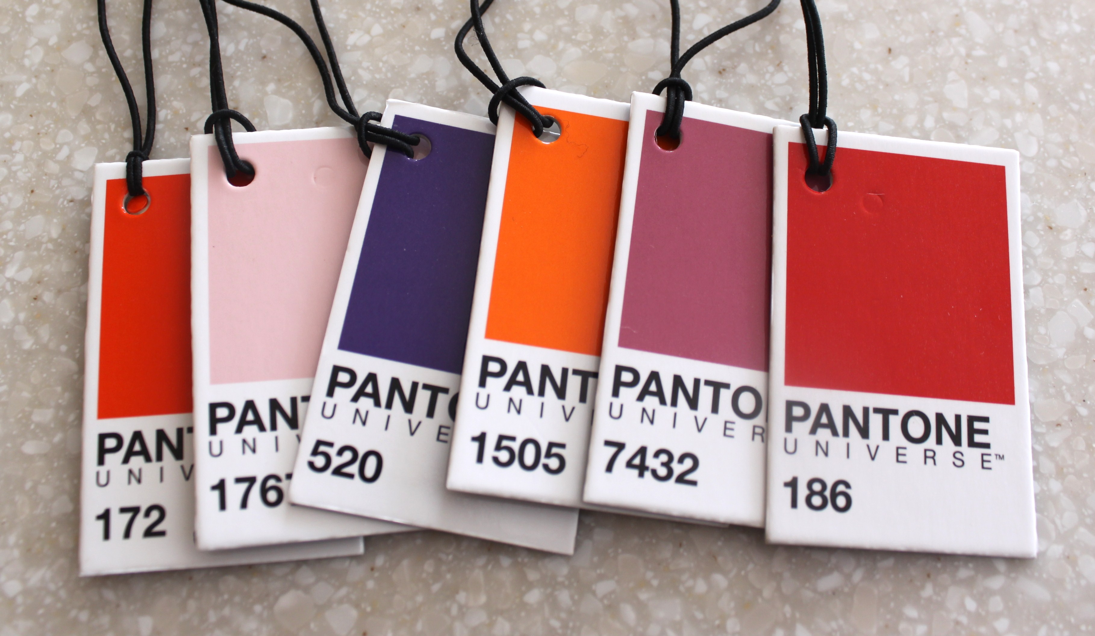
The mugs arrived with Pantone color chips tied to the handles so you can tuck them conveniently in your purse or wallet to use as a guide when selecting additional accessories for your kitchen or home.
Or you can use the color chips as inspiration for a bigger project. I plan on using this color scheme on my front porch this spring and summer. I can’t wait for the weather to warm up so I can get started.


Very cool!
I think so, too.
Both my husband and I are art directors. The good and maybe not so good by-product of such experience is when we want to describe a color to one another, it sometimes gets reduced to a PANTONE color number. That (fill in the blank) is a lovely bright 389 Green or this (fill in the blank) looks like a 032 Red. Now to pick out a mug that is in the same PANTONE colors as my company’s brand ~ a bright 165 Orange.
Years ago I worked as an artist for TRW. I still remember the color of their logo–Pantone warm red. My daughter says, “I don’t get your fascination with those mugs.” She never worked as an artist….
Wonderful! Colors are so amazing, aren’t they? It would be nice if we could give a color a name, but the number really nails it, unfortunately. Such a left brain/right brain combo.
Yes, a left-right brain combo, and I agree, colors are amazing.